
CASE STUDIES | URBANA

Urbana - New to Market Real Estate Development Marketing Solution
Project Brief & Background
The Urbana campaign was designed for our Major Project in the fourth year of the Graphic Design for Marketing program at the Wilson School of Design. We were given a semester to research and select an existing or hypothetical marketing situation and design a complete brand identity for the company with specific campaign deliverables. For this project, I had chosen to develop and brand a hypothetical new to market real estate development located in Burnaby, BC. This marketing campaign was directed towards young professionals on a strict budget, looking to purchase their first home. The individuals in this market were between the ages of 26 and 32 years, 50% male and 50% female. They belong to the middle class and make an average income of $45,000 per year. The goal for this campaign was to address and promote a solution to the current affordable housing debacle in the Lower Mainland of British Columbia. Urbana provides affordable housing solutions for young professionals searching for their first home. They offer housing with easy access to downtown Vancouver.
Problem
Right now, Vancouver is facing a serious housing crisis. The average price for a single, detached house in this city is listed at $1.4 Million (Balca, 2017). The vacancy rate in Vancouver for rental properties sits at just 0.7% (Ferreras, 2017). Other cities in British Columbia are facing the same epidemic. There are thousands of young professionals working in the downtown core who cannot afford to live in Vancouver. These individuals are living in areas such as Langley, Burnaby and Delta and are forced to commute long hours to get to and from work every day. The purpose of this project was to brand and market an affordable living solution for young working professionals who desire to live closer to the downtown core, without compromising their strict budget. This particular real estate development was based within a business to consumer market, facing high volumes of competition but had specific attributes that differentiated itself from its competitors.
Research
The research that was collected and analysed to contribute to the design’s success at its formative and evaluation stages, informing the design process, was based on extensive research in several areas. This research was centered on the chosen target market, competitive landscape, situation, unique selling proposition, user value propositions, product offering, positioning, marketing goals and objectives as well as social media strategies. Additional research was compiled for the minimum square footage requirement of a studio apartment in the city of Burnaby. This information was found by reviewing the City of Burnaby's Zoning Bylaw document obtained through the city’s website.

Strategy and Approach
This project was driven by a deadline of a three-month period, broken up into four different stages that include a Creative Brief, Concept Presentation, Comprehensive Design Development and Final Presentation. One of the strategies for executing this campaign was analyzing the competition by researching their brand identity, voice, values, strengths, weaknesses, USP, marketing strategies and brand positioning. Through examining competitors, I was able to conclude that there were some affordable options available, but the majority consisted of rental properties or homes that were missing a strong sense of community as well as easy access to downtown Vancouver. Through this campaign, I was determined to emphasize the attributes that made Urbana stand out from its competitors; a strong sense of community and easy access to parks, shops and restaurants. These qualities are extremely important to the target market, as they are searching for a rewarding urban lifestyle.
The second campaign strategy was reaching a clear understanding of the target market's wants and needs and integrating these into the campaign. Showcasing how these potential buyers could benefit from purchasing a studio at Urbana was a key approach, accomplished by implementing UVPs and the USP into the marketing solution and deliverables. This campaign informed young professionals that they do not have to compromise their strict budget for location, especially living closer to the downtown core. The severity of Vancouver’s housing market played a key role in how I approached this campaign.


Design Solution
Naming
The name Urbana is derived from two words: “Urban” which is significant to the target audience, not only for easy access to downtown Vancouver, but access to shops, restaurants and amenities, living an urban lifestyle. “Cabana,” symbolises people coming together under one roof, representing the strong community at Urbana and its inviting, professional and social atmosphere.
Imagery & Typography
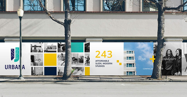
In the end, I had decided to direct my approach to not only design the brand to stand out from competitors but to highlight the development’s key features. Through developing the campaign deliverables, the primary focus was to use imagery that accurately showcased the development as a whole (Home + Community). The challenge with this concept was steering away from typical real estate development marketing and creating an original design. Many images in my campaign consisted of hard working and enthusiastic young professionals that make up Urbana and call it home. The brand’s colour palette uses of blues to represent trust, loyalty and integrity as well as yellow to represent the mind and positivity. The combinations of squares and various patterns were used as the supporting brand graphics for this campaign to represent the open windows and inviting atmosphere at Urbana. I chose to use Open Sans for the supporting brand typography because I felt that it provided a similar tone of the development; professional, confident and approachable. Each component was designed in a way that worked cohesively across the board for the brand to be easily distinguished.
Challenges
One of the challenges for this particular project was in relation to various time constraints. As a class, we received a generous amount of time for preliminary research and writing the creative brief. But when it came down to the actual concept ideation of the design approach and designing the deliverables, we were limited for time. This also presented a problem for our first round of critique in front of our instructor and faculty members. At this stage we did not have a logo or any kind of branding concept for the identity. It was simply a presentation to show our concept of the hypothetical company we were branding. Ideally, it would have been beneficial to be further along in the design process and receive feedback earlier on regarding potential design directions for the brand, giving us more time for revisions.
Effectiveness / Results
At the end of this semester, I presented this project to my professor, the class and other design students and faculty. In the end, I had received a lot of great feedback and a couple of suggestions which allowed me to make some small adjustments to my design deliverables. Some of the feedback that was mentioned was “good brand name relating to the offer,” “well resolved brand visual identity – the scale difference between logotype and symbol could be adjusted” and “well defined supporting colours and typography.” After receiving feedback from the final critique, I was able to come to the conclusion that this campaign provided an effective solution to the initial problem I had proposed to resolve from the beginning. Some of the quantifiable results I gathered to measure effectiveness of this campaign came from posting my project on Social Media. In December, I uploaded the full scope of the project and its deliverables to Instagram. As a result of uploading that project, I had received nine followers from international real estate development companies. As of March 2018, Urbana was the second most popular (liked) project on this social media platform. To decrease our environmental footprint, we chose not to hand out direct mail pieces to potential buyers, but focused our efforts on promoting the campaign through social media, billboards and trade show booths.
Additional Information:
Process
I first began my process by determining the type of target audience I wanted to market to. I started brainstorming a list of potential names for the hypothetical real estate development after determining the specific direction. Once I had settled on a name, I started to sketch as many different logo concepts I could come up with to represent Urbana. These sketches were then brought into Adobe Illustrator where further exploration and refinement took place. Overall, the design and style of the deliverables changed throughout the process after receiving feedback from my professor, faculty and students at different stages. In the end, this feedback led me to develop a solid marketing communication solution that I was confident in.


Potential Names:
The Walden at Central Park
Cambria
Urbana
Hayden

Expected Deliverables/ Go Beyond
The expected deliverables consisted of a brand identity as well as three additional campaign components. I chose to create a website, hoarding boards, large scale poster for advertising, a mobile display booth for trade shows and events, signage and a brochure for Urbana. I felt that the hypothetical real estate development I was designing would benefit from creating six deliverables for people to fully understand the scope of the brand.
Citations
Balca, D. (2017, November 03). Vancouver the least affordable housing market in North America: Study. Retrieved March 25, 2018, from https://bc.ctvnews.ca/vancouver-the-least-affordable-housing-market-in-north-america-study-1.3663134
Ferreras, J., & Beja, T. (2017, September 13). Vancouver's rental vacancy rate is near zero. Here are 7 ideas to help lift it. Retrieved March 25, 2018, from https://globalnews.ca/news/3739543/vancouver-rental-vacancy/