BEFORE

BEFORE
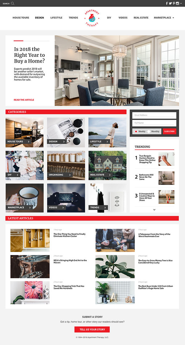
APARTMENT THERAPY WEBSITE RE-DESIGN
Brief:
Design/ redesign a blog using content curated and test the responsiveness of the blog's typography and grid reflow. Redesign to improve the typography, overall layout and user experience.
Concept:
I chose to redesign the Apartment Therapy blog because I was drawn to the content they cover. I noticed that their type scale was very minimal and did not have a respectable range of type levels, which was something I wanted to improve on. I also took the initiative to redesign their logo that better suited the content they posted. Analyzing Apartment Therapy’s overall layout, I noticed there were a lot of gaps throughout their pages which I wanted to fix and clean up. Their original type choices were modest but I wanted to find a few that was more representative of their content and character. The new layout contains a more obvious level of hierarchy and breaks up the articles in a more visually pleasing way.
Photo Credits:
Apartment Therapy Landing Page [Screenshot from Apartment Therapy website]. (March 7, 2018). Retrieved March 26, 2018, from https://www.apartmenttherapy.com/